Lil Wood Diner
Spring 2023
Branding
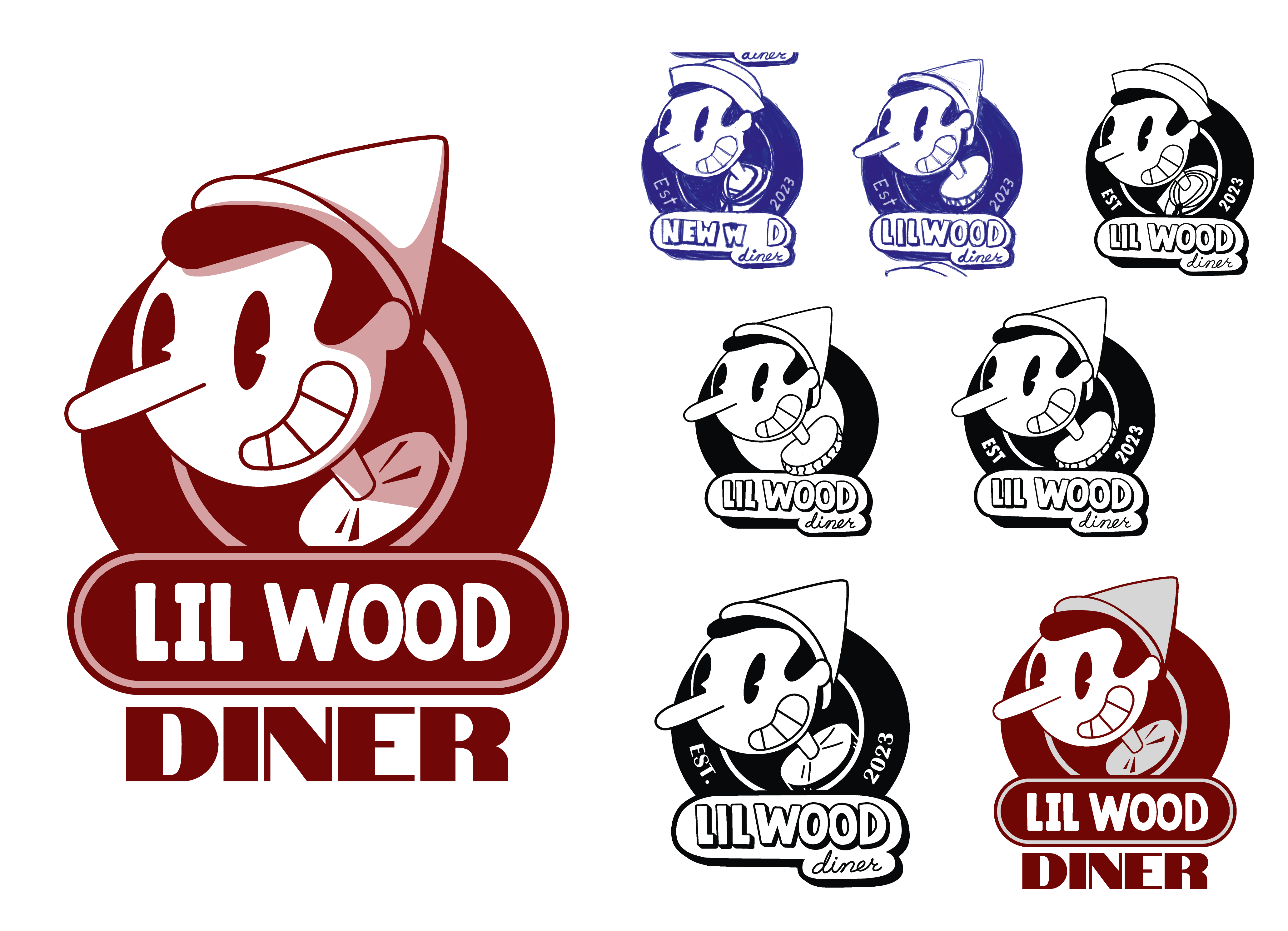
Lil Wood Diner is a playful branding project that reimagines classic diner food using cricket flour as a sustainable alternative ingredient. The concept cleverly ties together the Pinocchio "not a real boy" narrative with "not your traditional pancakes." Drawing inspiration from rubber hose animation aesthetics and 80s/90s diner nostalgia, the brand uses whimsical visuals to make innovative cricket-based comfort foods approachable and appealing to modern consumers seeking eco-conscious alternatives.
trigger
trigger
Logo
This logo has been made and reworked dozens of times but at it's core it was to be the face of Pinocchio. I took inspiration from the way Porky Pig from the Looney Toons pops out of the circles at the end of the show.
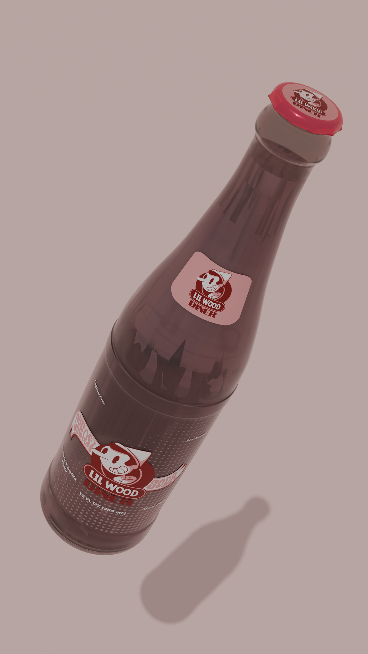
Blender Bottle
I wanted to make some collateral that would fit with the diner idea but also allow me more practice with blender. I decided to make a cream soda for the brand.
Process
I removed pages and cut down features that were too specific. The goal was to streamline the site for possible collaborators and professionals.
Process
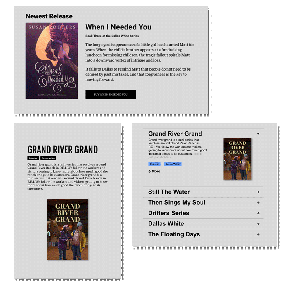
I consolidated content under new section umbrellas for simplicity. I renamed the writing and film sections to provide clarity about her roles in different creative projects. Lastly I added sections to highlight her upcoming work, share a bit about herself, and show contact information.
Process
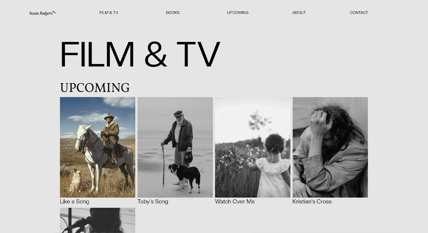
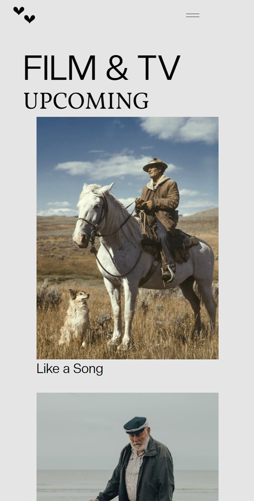
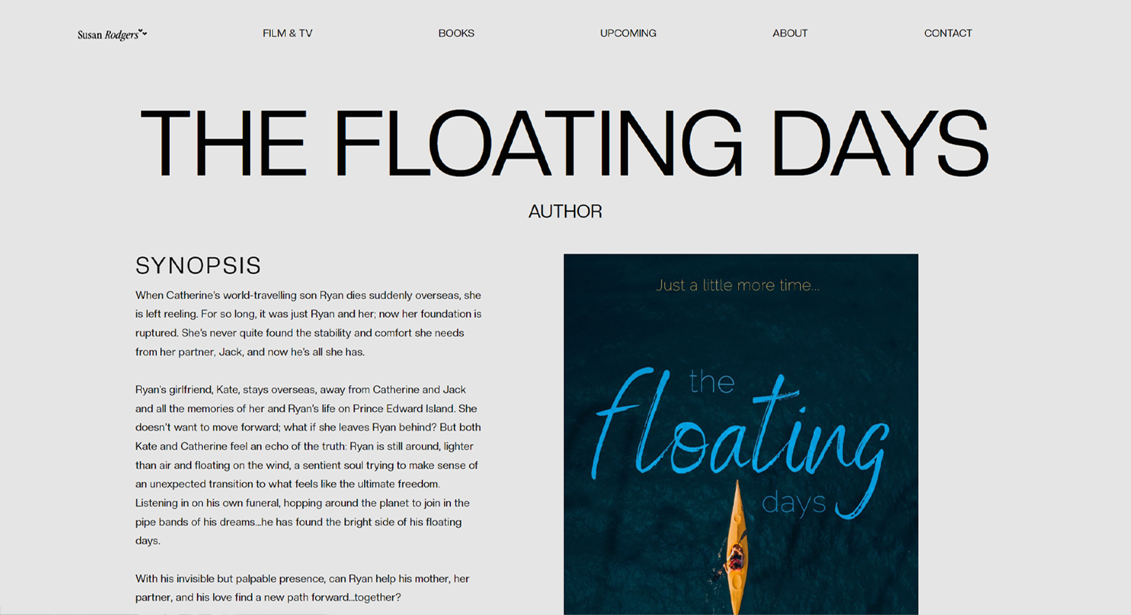
The other big task was to take advantage of the CMS feature within Webflow and sort out the project pages.
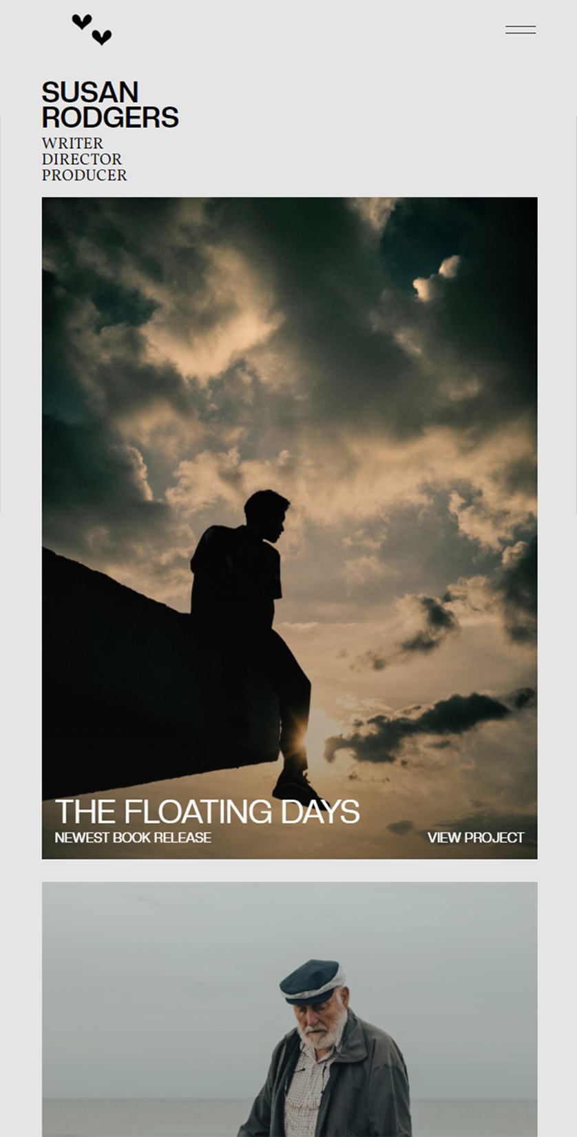
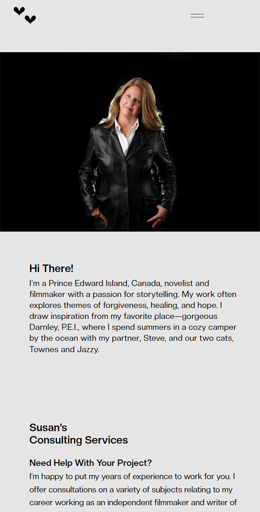
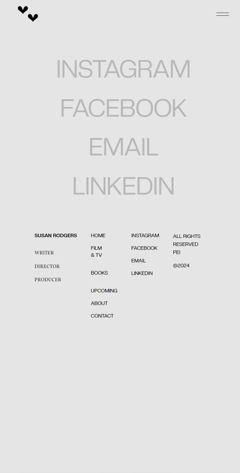
After
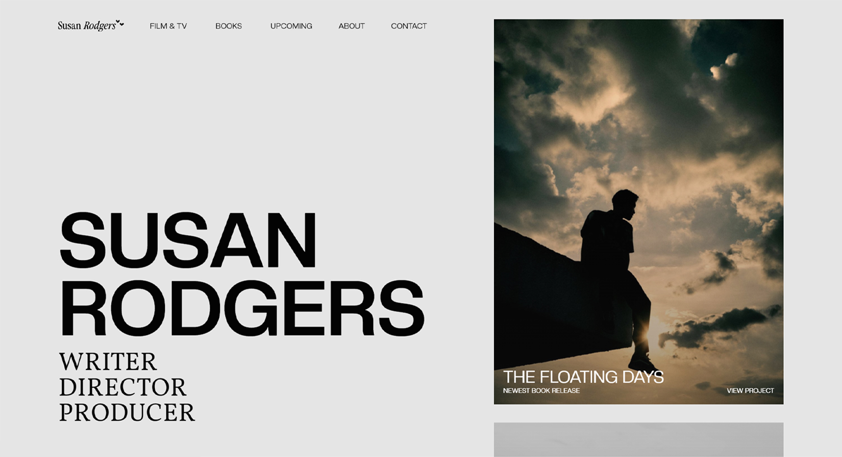
The rest of the website ended up being more straightforward. The home page would highlight some of the her latest and upcoming work. The project directory just needed to house a way to navigate to projects. Her about page was short and sweet and the contact page was fun and bold.
The Client's Take
Jacob Chong jumped in with both feet to develop my brand new website. With my mix of film projects and novels, it was challenging to establish consistency because the images that pertain to my work are varied in colour and style. Jacob came up with a plan to utilize complementary colours in a design that would unify the website and also make it easy to navigate. Now, when I need changes such as new awards added, Jacob dives in and makes the edits almost immediately. He’s got a great attitude and he communicates timely. Best of all, the website is sleek and clean, and professionally reflects myself and my brand. I love sending people to it!
- Susan Rodgers