Grad Video
Spring 2025
Storytelling Illustration Animation Editing
In my final year at IDEA School of Design (Capilano University), we were asked to create a video for our grad show. Rather than settling for a simple slideshow of past projects, I treated the assignment as a standalone piece — a chance to design a video that not only showcased my work but reflected my creative voice, personality, and approach as a designer.
trigger
trigger
trigger
trigger
trigger
Full Video
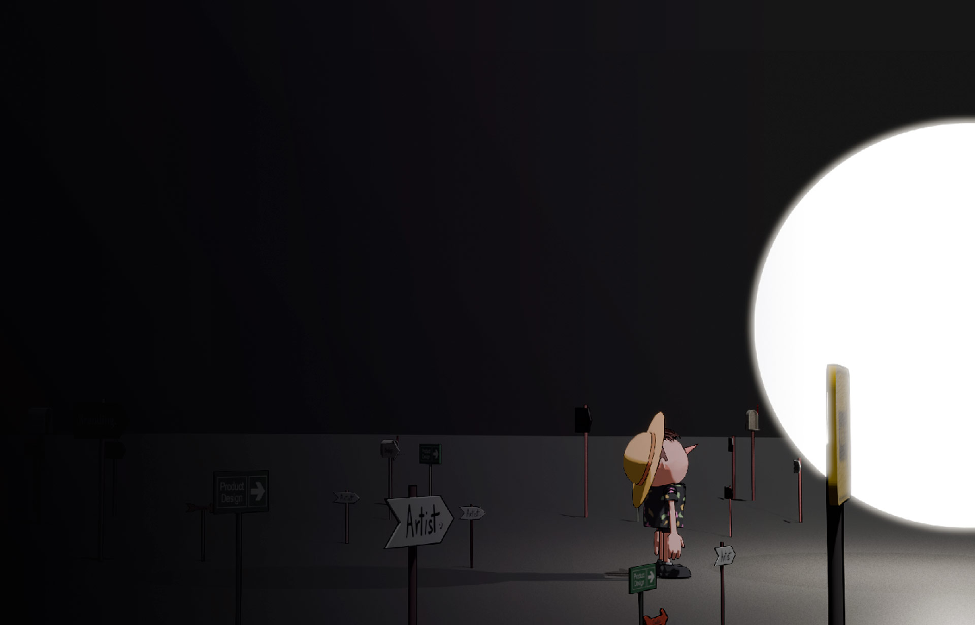
This logo has been made and reworked dozens of times but at it's core it was to be the face of Pinocchio. I took inspiration from the way Porky Pig from the Looney Toons pops out of the circles at the end of the show.
Concept & Storyboarding
With a strict 1 to 1:45 minute runtime, I began with a rough storyboard. From the start, I didn’t want to just show projects I've made over the years in school — I wanted to highlight who I am and show off my storytelling chops. The script and visual sequence I created expresses my point of view as a creative, not just an animated portfolio.
While the final video deviated from the original storyboard in some moments — due to timing, practicality, or simply what worked better visually — the core narrative remained consistent.
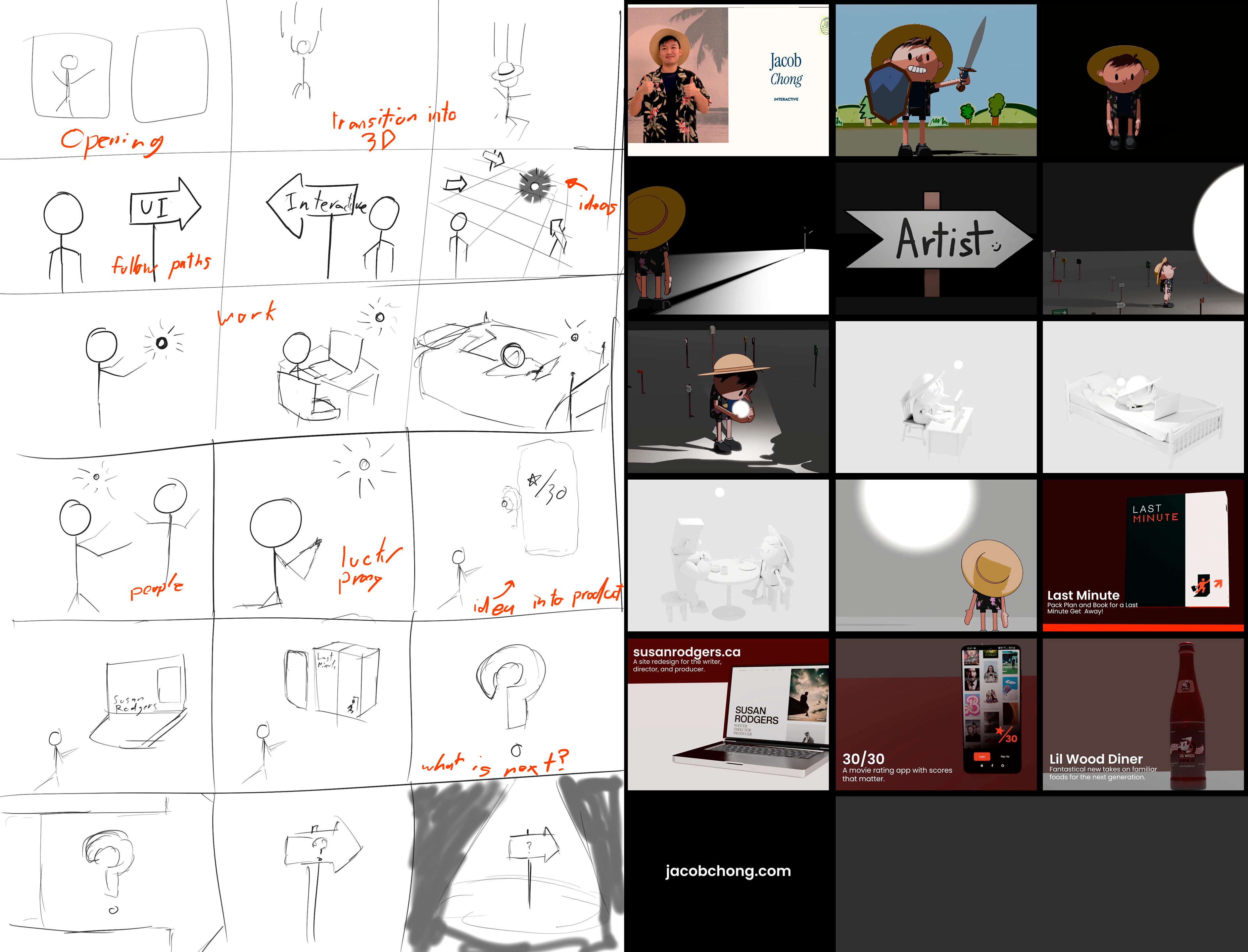
Style & Animation Techniques
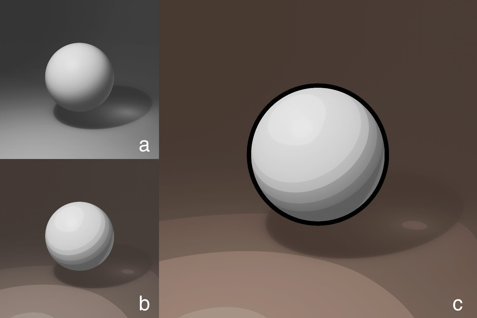
Most of the animation was created in Blender, with additional assets illustrated in Procreate. To push the stylization further, I used Blender tools to give the video a hand-drawn, cartoon-inspired look — a deliberate choice to match the tone of the script and emphasize personality over realism.
- fig. a: Blender’s default rendering style
- fig. b: Changed materials with shader nodes
- fig. c: Added Grease Pencil outline
Technical Challenges
One of the biggest challenges was managing time around rendering. Each sequence took several hours, so I had to plan carefully — prepping assets during the day and rendering overnight, hoping each morning that the results matched my intent or were at least salvageable.
- Here is a video that highlights how time is an obstacle while rendering. This 3 second 30fps animation took over 3hrs to render.
Reflection & Takeaways
This project was deeply rewarding, and full of lessons. Looking back, I would have spent more time in pre-production — especially refining timing between animation and voice-over, and selecting music that better supported the narrative. I also learned the importance of rendering in smaller chunks to save time and make adjustments easier. What I loved most was combining so many disciplines — storytelling, illustration, animation, editing — into one cohesive piece. It pushed me outside my comfort zone and showed me how much more there is to explore across creative fields.
Reflection & Takeaways
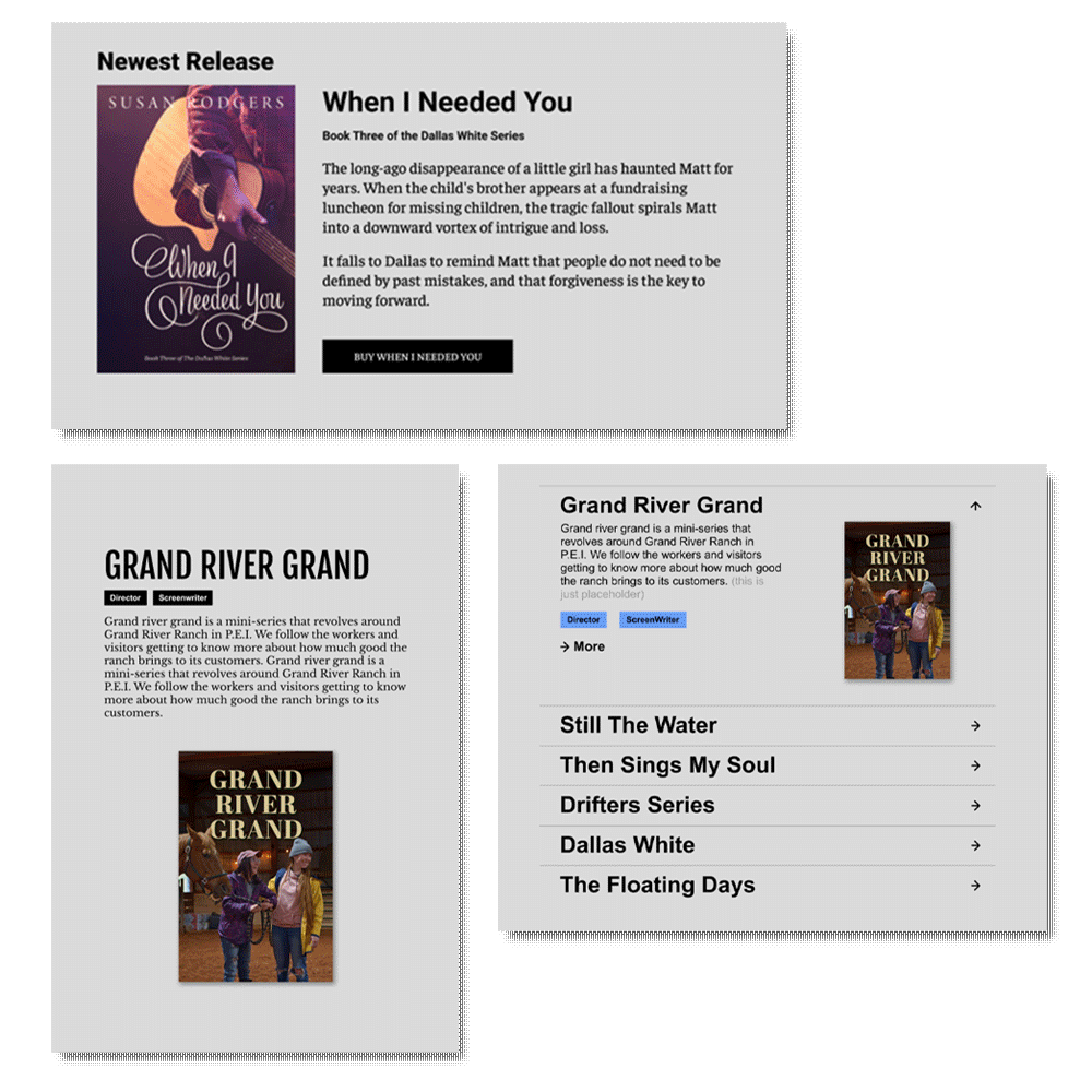
The rest of the website ended up being more straightforward. The home page would highlight some of the her latest and upcoming work. The project directory just needed to house a way to navigate to projects. Her about page was short and sweet and the contact page was fun and bold.
The Client's Take
Jacob Chong jumped in with both feet to develop my brand new website. With my mix of film projects and novels, it was challenging to establish consistency because the images that pertain to my work are varied in colour and style. Jacob came up with a plan to utilize complementary colours in a design that would unify the website and also make it easy to navigate. Now, when I need changes such as new awards added, Jacob dives in and makes the edits almost immediately. He’s got a great attitude and he communicates timely. Best of all, the website is sleek and clean, and professionally reflects myself and my brand. I love sending people to it!
- Susan Rodgers